
Thursday, 29 December 2011
Tuesday, 29 November 2011


Shot list
Shot List (referring back to storyboard)
Frame 1
Establishing shot – showing the city and giving a wide view of the surroundings.
Frame 2
Extreme close up shot- showing the lips of the character
Frame 3
Very close up shot – showing the shoes of the character, showing movement
Frame 4
Very close up shot – showing the character holding newspapers in her hand/arm
Frame 5
Long shot – shot a full-length view of the character, this will show the costume and expression/body language.
Establishing shot – also showing the surroundings of where the character is.
Frame 6
Close up shot – showing the characters facial expression.
Frame 7
Wide shot – showing main character and friends sitting around a table in a pub like environment having a laugh
Frame 8
Close up shot - A letter that shows she has been rejected from a job she applied for.
-Zooms out-
Frame 9
Medium shot/Reaction cut - showing facial expressions towards the letter she has received.
**FILM TITLE /CREDITS**
Frame 10
Long shot - shot a full-length view of the character, this will show the costume and expression/body language.
Frame 11
Medium shot – showing the character winking and walking away from the camera.
**FILM CREDITS/ OUT IN CINEMA’S NEAR YOU SOON**
Thursday, 17 November 2011

Costume Plan for Main Character - Wilma
MAIN CHARACTER COSTUME BEFORE MAKE OVER

MAIN CHARACTER COSTUME AFTER MAKE OVER

Wednesday, 16 November 2011


Treatment
Working title: From Geek to Chic
Estimated Duration: 1 minute
Style: My film trailer is going to be a Comedy Drama (Dramady) and I will try to create a film that attracts male and females like Mean Girls, Devil Wears Prada and Freaky Friday; which are Comedy Drama films that have been successful in doing so. I will try to make it as realistic as possible as the storyline I have chosen is something that actually can be a situation that can come up in some people’s life. The influence for my film trailer has to be Ugly Betty (2006), which was an American Comedy-Drama television series about a girl who struggles to cope with high status people and pressure at an editorial magazine company.
Rationale: This production is relevant to my target audience as the main character in the film can be used as someone that people can relate to because the situation in my film is something that can take place for my targeted audience. Its reflective to current media trends as there are many film that are releasing where the main characters is either someone who plays a role between the ages 16-26 or is relatable to the audience.
Synopsis: A young lady named “Wilma”, known as “Willy” for short, is an American born fashion student who moves to London for an open opportunity to work for Allure which is a fashion company owned by Tasha Sweeney, a world known fashion designer. This being her biggest chance to fulfil her dreams and work her hardest she is set back by her appearance. Wilma was known as a stereotypical geek back home in America. She sends her application off to company but faces rejection. She realises that the company is looking for an attractive girl who also has brilliant knowledge on fashion. After facing rejection, she then changes her look to prove she is capable for the job.
Intended Audience: The intended audience is males and females, aged 16-26. They most likely will have some sort of similar interest to fashion or find the main female attractive. Freaky Friday and Mean Girls were also targeted at both genders and is proven to be very popular with both too.
Feasibility: This project should be workable, as I’m not using any complicating major cinematography effects and my genre that I have chosen is simple and depends more upon the acting.
Format: I will be using iMovie and Final Cut Pro as my technologies to create my product. I will use a Canon 5D mark II and Sony HVR-A1E and I will burn the final video into a MPEG4 format.
Budget: I wont need to spend any money in order to complete my project. My actors in the trailer will be working for free and also will be using some of their own stuff as props for the mise en scene. The rest of the props and locations in the trailer have been sourced and there is no cost for them.a
Thursday, 13 October 2011
Voice of the people
Above shows a quick video I made to get some people's opinion on what they expect to see in a film trailer.
From this short video I have gathered that they would like to see something important, some sort of main action of the film to be shown which will make them want to watch it or even result to them watching it in the cinema.
Primary Research - Analysis of Film magazine covers

Above shows a magazine cover from "Total Film". I have shown a totally different film genres magazine cover to show the layout. The image on the cover is a medium close up of a character from the film that is being promoted on the front cover of the magazine. The position of the image has been aligned to the right hand side in order for the writing to be around the picture. There is a sense of space around the image in order to fit the text that is crucial. The layout of the magazine is vertical and portrait. The lighting in the image looks high key and looks like it has been taken in a studio. The masthead of the cover has been made bold and big and the colour also compliments the text on the page aswell. The designer of the cover has used colours to compliment the image so that it looks attractive to the audience. They have used a female on the front cover who is meant to attract males and females for the sex appeal and for the huge status she has in the film for fashion and fame. Notice that the model on the cover is looking directly at the camera which is a huge way to attract a passing customer. Giving eye contact is a major way that appeals to the audience because it looks as if the model is look at you no matter where your looking from. As we can see the models head in covering the masthead which is purposely done, this is because the magazines title is very easy to remember and because of the consistency of the layout its remembered very well and is easy to now recognise.


Above shows another magazine cover from another film publishing company called "Entertainment weekly". This magazine cover actually has less text making it look a little more empty - creating a sense of space in certain areas. The image is a portrait close up of a character from the film that is being promoted on the cover. Notice that the model on the cover is looking directly at the camera which is a huge way to attract a passing customer. Giving eye contact is a major way that appeals to the audience because it looks as if the model is look at you no matter where your looking from. The typography on this magazine cover is actually pretty consistent and simple making it a little boring. The colours used in this are dull but compliment the image as the image itself is captured with a dull effect.
Tuesday, 11 October 2011
Genre
Every film is categorised into different genres in order to be suited for their target audience.
There are many genres such as:
- Action
- Adventure
- Comedy
- Crime and gangster
- Drama
- Historical/ Epics
- Horror
- Musical/Dance
- Science Fiction
- War
- Westerns
The above genres are broad in order to fit every film that has been made but film catergotries are never precise.
Steve Neale
Neale talks about the conventions in products which allow you to recognise which genre fits with the film.
Friday, 7 October 2011
Primary Research - Analysis of film posters
Devil Wears Prada (2006) David Frankel

Above is the poster for the dramady "The Devil Wears Prada". We can see a shoe with a heal that is a devils pitchfork. The image itself supports the title of the film as we can see the pitchfork which automatically tells us its to do with a devil and the title also has "devil" in it. The director who thought of the illustrations has carefully thought of the denotations and connotations so that it can have more then one meaning to it. The denotation of this image is just a shoe that has been made into something slightly devil like. The connotation of this image is linked the title of the film. "The Devil Wears Prada", this title links to the shoe as the shoe is made for the devil to wear. The colour of the shoe tells us it is for the devil and the heel of the shoe also tells us it is for the devil. The title says "wears" in it, meaning that the shoe is there for it to be worn - shoe is for the devil.
We know that the shoes symbolises a female because of the type of shoe it is - so this shows its a film for women (chick flick) "This is a well-built film. Oh, it’s a chick flick supreme, but ultimately it is a darn good movie. The piece is about Andy, a smart but naive young woman from Ohio, who finds herself assisting a cruel fashion magazine editor in New York City. Basically this is the mother lode of chick flicks. There are clothes, boy trouble, girly politics and more clothes. "
(http://www.goodnewsfilmreviews.com/2008/08/devil-wears-prada-2006.html)
The images composition is in the central position because it is the first thing that catches your eye and you focus on it automatically. This could because it is the only image of the poster or it is the brightest thing on the page, the red does play a huge part in the poster. With the framing we do get a sense of space, that space is used for the writing around the image. The space on the poster does make it very simple and the poster itself speaks for itself which is a good point because you don't want the poster to look so confusing. We also can see that we have a close up of the shoe and is a portrait image which is normally what we will see on posters. This has been done to allow us to see the image properly and get a good view of whatever is on the poster.
The lighting in this image is a complicated part to discuss because we can see that the image has some sort of shadow which makes the image look like it has been taken with high key lighting and back lighting but the image also looks like it has been manipulated in order to create a devilish effect with the dark shadowing on the red shoe. We know that the image has been manipulated because of the effects and the heel of the shoe which is the pitchfork. This all reflects the style and creativity in the film.
The typography and text used all over the cover suits the cover and compliments the style used on the cover. The masthead has been made reasonably big in order for people to see but has been made smaller compared to the image. This can also show the power of the devil which is represented in the image. The actors names that have been shown on the top left hand corner if the poster have also been made in the contrasting colours of the poster. The colours have been consistent and dull which suits the kind of impression that the director has put on the film. The colours and title do not give off an exciting and positive impression instead it gives off a negative and dull impression.
Overall, I think that this poster for the film "The Devil Wears Prada", is appealing and shows creativity and style which is what the film is about. The fashion aspect of the film is reflected through the image and the style of how the poster is set out.
Juno (2007) Jason Reitman
Juno (2007) Jason Reitman

Above is a poster for the dramady “ Juno” which is about a 16 year old high school student that discovers she is pregnant and decides to confront her family and friends with the truth - deciding to keep the child.
What we can see is a very colourful poster for a film. We can see that it is a film made for teenagers about teenagers because of the typography and use of colours and artwork layout. The denotations of this poster is what we can see and we can gather that the film is about a girl who is the protagonist and the boy standing near her. We can see that the film is to do with the girl who is a teenager - this is shown through colours and layout once again. The connotations of this poster is that it is for teenagers, for the younger audience, because of the colours and so on but its about a girl who is pregnant which is shown through the image. Its showing us that the film is about a young pregnant girl which is generally not something many people would see at schools and colleges. The facial expressions and body language show that the film has a confusing storyline and not a lot of positive stuff happens in the film because of the situation.
The thing that mostly stands out for me is the colours on the poster - the stripes. This helps draw attention to the poster - helps find its targeted audience. The image itself isnt as a central position, broken the rule of thirds. The image is put to one side of the poster in order for the text to put around the image. This also could be done like that because they girl is pregnant, so to emphasise the bump, the writing it put around it. The posters is portrait showing a full length image (long shot) of both characters which helps show what the characters are like as you can judge them from their outfits. This helps us know that they are teenagers because of the kind of clothes they are wearing. The stripes in the image also look like they have been used to compliment the image, because the characters in the image are wearing the same kind of colours and has the consistency of stripes - showing a connection between colours and patterns making it more young.
Within the horizontal layout you can see that the lighting of the image is high key even though it has been manipulated to sit on a stripy background. I can tell that the image has been done with high key lighting, because they are very bright and each feature of the subjects in the image are not shadowed and all in full view.
The typography on this poster is suitable for the theme of the poster and genre of the film. Its a very child like font and the size of the mast head used on the poster is on a bigger scale compared to the rest of the writing on the page. The mast heads colour has been made a different contrasting colour in order to stand out from the selection of the colours that have already been used - mainly oranges. The writing all over the poster other than the mast head is a different font and is kept consistent so that the page doesnt look messy and so everyone can read it. That information is not what people would generally look at first, which is why the title of the film has been made with a different font to make it stand out and compliment the genre of the film and target the right audience.
Overall, I think the film poster is suitable for the genre of the film and appeals to right target audience and shows us that the film is about teenagers.
Miss Congeniality (2000) Donald Petrie
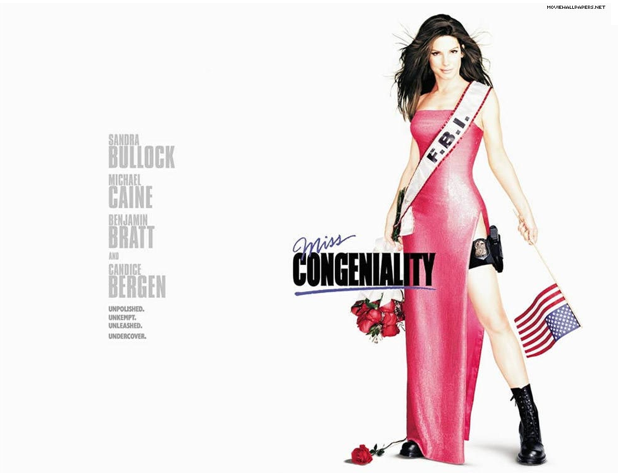
Above is a poster of the film "Miss Congeniality" which is about a young lady who works for the FBI in America and has to go undercover at a beauty pageant in order to stop a group from bombing the main fashion event.
What we can see on the poster in the protagonist showing her two roles she plays. This helps get an understanding of what is going to happen in the film but also can confuse a lot of the audience which may help attract people to the film. The poster itself is classy and simple which helps the picture speak for itself. The denotations of this poster is what we can see which is a woman that is dressed in a feminine dress with shoes that dont match her dress but match her FBI uniform. We know that she is part of the FBI because on the sashe she is wearing it clearly states that which helps identify the second role she plays in the film. The connotations behind this is that the protagonist is obviously wearing the what she is wearing to show that the film may be about her being someone else without people around her knowing about it. The audience knows what she is doing and what the reason behind it is but the people in the film have no idea.
The image composition has been done to right hand side of the page showing a long shot of the character. This image shows the body language of the character and as we can see you has a very powerful position that she is standing in but also making it look pretty feminine. The image being on the right hand side of the image creates a sense of space which is where we can see the text on the poster. The poster itself is landscape with a vertical layout.
The lighting looks like it is high key because each feature and each area of the image is in clear focus but the character in the image itself looks manipulated. The character in the image looks like it has been made to look like a doll with a plastic look to it and overexposed look.
The typography on this poster has been kept consistent. Theres been a different font that has been used for the word "Miss" and for "Congeniality"to show the 2 different sides of the character - a bold and a classy font.
The rest of the font has been made to be consistent with the word "congeniality" and has been put into a different colour in order to make the main image and the title of the film stand out on the white background poster.
Overall, I think that this poster is simple and the denotations and connotations have been thought out well in order to show the film through an image.
Thursday, 6 October 2011
Cross Media Ownership/Advertising
Cross Media Ownership is when a company owns a variety of businesses in different areas of the media industry.
An example of this is:
Time Warner owns Warner brothers (film), Warner music (music), Time (magazine) and VUE (cinema).
This is a very popular example of cross media ownership.
Cross Media Advertising - advertising the same product or service across several different types of media. It includes advertising in all of these areas:
- Radio
- Magazines
- TV
- Mobile
- Online
- Newspapers
- Podcasts
- Film
- Theatre etc
This is a perfect example of what I am doing. Cross media advertising is used in my advanced portfolio by advertising one product over 3 different services, which is a film being advertised as a film teaser trailer, poster and magazine cover. These are 3 main and important ways to advertise.
Each product has something similar in order to show its consistency. For example the typography is the same that is used in the film trailer, on the film poster and on the film magazine cover. This helps with the advertising as the audience will be able to then recognise the typography when seen on many products that help advertise.
New Media
For this project so far I have been using and have planned to use the following programmes/software and equipment:


 Photoshop will be mostly used to create and edit my magazine cover and poster for the promotion of my film that I will be making a teaser trailer for. This will be the professional touch to my work as this programme is popular when creating products like I will be doing. I have had a lot of experience with photoshop so I shall use my previous knowledge to complete my products the way I would like them to be.
 Imovie will also be used when creating my VOX POPS to find my target audience. I will cut clips in order to create a smooth running short video of people I have questioned.
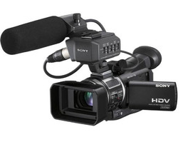 This is a HDV 1/3" CMOS Palm camcorder and has advanced features for professional use. CMOS means the HRV-A1E is an ultra compact camcorder which is capable of providing HDV in 1080 line resolution. This is suitable for the creation of my film teaser trailer.

- Blogger - For my blog, where all my updated work will be stored
- Microsoft Excel - for my questionnaire graphs
- Microsoft Word - for basic write ups and rough planning
- Adobe Photoshop CS4 - for all editing of images and artwork creation
- Final Cut pro - to edit all footage and create my final trailer
- Imovie - to edit and create certain parts of my final product.
Each of these software/programmes that have been listed above will come in use at different stages of my project for different reasons.
Camera's
Sony A1 camcorder - HVR-A1E
The camera that I have main access to is a Sony A1 Camcorder - HVR-A1E.
Canon EOS 5D MARK II

I also have access to a Canon EOS 5D Mark II. Canon is now a great new technology for media specialists with its great features that allow you to get results that you wouldn't expect. The creative and complicated shots that people today do in music videos or even major graphical scenes in movies are normally now attempted with this camera.
It has a full HD 1080 movie recording output and a 21.1 megapixel full frame CMOS sensor giving you a vivid, clear image.
Depending on the circumstances, I will try to use this camera for my final film teaser trailer.
Wednesday, 5 October 2011
Questionnaire
I asked 20 people what there views were on film teaser trailers in order to get an insight on other peoples opinions. This will help me when I need to create my trailer to target my selected audience. I tried to ask an even amount of male and females. This questionnaire contains 9 questions and is mainly multiple choice. My targeted audience is students/working adults (16-25). This is because I have seen that majority of the audience I had questioned are between this age group and have selected comedy as one of there genres they prefer. In my targeted audience, I have not chosen what gender I would like to mainly target because after analysing some trailers like Mean Girls and Freaky Friday are not only girly films, they have also been watched by many males. These trailers that I have analysed portray a feminine approach but are proven to attract both genders.
Question 1 - Are you?

I tried to ask an even amount of male and females to make it fair and get different opinions on my questions.
Question 2 - How old are you?
Majority of the people I asked were students in the age group of 16 to 25. This helped quite a lot because I could then see the different choices of the students are in the similar age group as I am. I tried to make sure that I questioned a few different age group people to get a variety of answers.
Question 3 - What genre of film do you prefer? – (select two)

The genre I have selected to work on is Drama and Comedy - Dramedy. The highest vote on their preferred genre was Comedy which helps me a lot because I can now see the age range for those that selected comedy. Theres a range of different choices of genre chosen in this question which shows that the people that I have questioned have different styles of genres that they would rather watch. The least favourite genre was horror, this helps me know that the audience that I have questioned do not prefer horror and if I were to of selected this genre to work with it would of been a bad idea, baring in mind my targeted audience. I allowed the people that I questioned to select 2 genres of film in order for me to get a range of answers. This told me what their favourite was and what their second favourite was and this two choices are important to know in order to cater for my targeted audience.
Question 4 - What was the last film you watched?
Yes 14
Most people said that images in a teaser trailer are what makes it more memorable. Actors had the second highest vote. A trailer is made up of moving and still images depending on the concept that the director has gone for. Actors is generally what people go for when looking at a trailer because they would see if their favourites actors are featured in it so they can go see it in the cinema or so on.
Question 8 -

The longer the trailer is the more you get to see of the featured film which sometimes could ruin the surprise or the twist in a movie or could be an advantage and help add more suspense and build up the excitement for the films realise. The most popular voted option was 1-2 minutes for the length of a teaser trailer. This personally is a good length for a teaser trailer because you could get the most basic storyline fitted into the trailer along with great graphics which appeals more to the audience.

Action scenes was what was chosen as the what would liked to be shown in a teaser trailer. This something that you can expect more in order to build up the excitement and suspense towards a film. A basic storyline is also what may be a good way to advertise a film but some may say it ruins the surprise of the storyline. Its an advantage because we will know after seeing the basic storyline in the trailer what kind of film it is, if its suitable for the right audience, if its got the best actors in it, if its your favourite genre etc.
Question 1 - Are you?
Male 9
Female 11
Female 11

I tried to ask an even amount of male and females to make it fair and get different opinions on my questions.
Question 2 - How old are you?
15 under 1
16- 25 14
26-35 3
16- 25 14
26-35 3
36-45 1
46-55 1
56 + 0

46-55 1
56 + 0

Majority of the people I asked were students in the age group of 16 to 25. This helped quite a lot because I could then see the different choices of the students are in the similar age group as I am. I tried to make sure that I questioned a few different age group people to get a variety of answers.
Question 3 - What genre of film do you prefer? – (select two)
Horror 1
Romance 5
Action 4
Romance 5
Action 4
Comedy 8
Musical 0
Sci fi 3
Musical 0
Sci fi 3
Thriller 5
Other (Fantasy) 2
Other (Fantasy) 2

The genre I have selected to work on is Drama and Comedy - Dramedy. The highest vote on their preferred genre was Comedy which helps me a lot because I can now see the age range for those that selected comedy. Theres a range of different choices of genre chosen in this question which shows that the people that I have questioned have different styles of genres that they would rather watch. The least favourite genre was horror, this helps me know that the audience that I have questioned do not prefer horror and if I were to of selected this genre to work with it would of been a bad idea, baring in mind my targeted audience. I allowed the people that I questioned to select 2 genres of film in order for me to get a range of answers. This told me what their favourite was and what their second favourite was and this two choices are important to know in order to cater for my targeted audience.
Question 4 - What was the last film you watched?
Alien vs Predator
Sex in the City
Burlesque - 2
Star Trek
Cars II
Street Dance 3D
Tangled
West is West
Harry Potter 7 part 2
Pirates of the Caribbean
Jane Eyre
Red Riding Hood
Sin City
Toy Story 3
Spongebob Squarepants
Above shows the films that they recently watched. This doesn't support their choice in genre but we can again see the kind of films they would enjoy watching.
Question 5 - Do you see a lot of teaser trailers whilst watching TV?
No 5
Sometimes 1
 Majority of the people I questioned said that they watch a lot of teaser trailers whilst watching TV. This helps me a lot because I can see that the people that answered the question do watch a lot of TV in order to see the new trailers around. This is a huge advantage because if we were to have a trailer air on TV, we would know that a lot of people would be watching it. Trailers take up a certain amount of time in between movies or programmes, part of the advertisements, this is how we know many people would stop to watch it. Various types of trailers come on during the day depending on the suitable certificate ratings for everyone to watch. Trailers can be made serious, scary, or funny and this does attract a lot of people and trailers which are short keep the audience thinking about the film.
Question 6 -


Question 6 -
How would you like to see an advertisement of a film?
Billboard 4
Trailers 13
Magazine advertisements 2
Radio advertisements 0
Newspaper reviews
1

This question was very easy for people to answer because they said they would prefer to see advertisement of films on the TV as a trailer rather then anywhere else. The most popular option out of all answers was trailers. This is because trailers are the most important form of advertising in the movie industry.
Question 7 -
What makes a teaser trailer most memorable?
Actors 6
Images 9
Sound 3
Title 2
Title 2

Most people said that images in a teaser trailer are what makes it more memorable. Actors had the second highest vote. A trailer is made up of moving and still images depending on the concept that the director has gone for. Actors is generally what people go for when looking at a trailer because they would see if their favourites actors are featured in it so they can go see it in the cinema or so on.
Question 8 -
How long do you think a teaser trailer should be?
30 seconds 0
30 seconds to 1 minute 8
1-2 minutes 11
2-3 minutes 1
3 minutes + 0

The longer the trailer is the more you get to see of the featured film which sometimes could ruin the surprise or the twist in a movie or could be an advantage and help add more suspense and build up the excitement for the films realise. The most popular voted option was 1-2 minutes for the length of a teaser trailer. This personally is a good length for a teaser trailer because you could get the most basic storyline fitted into the trailer along with great graphics which appeals more to the audience.
Question 9 -
Would you like to see in a teaser trailer…
Action scenes? 8
Introduction of characters? 5
Basic storyline? 7
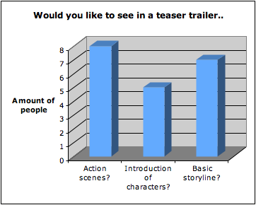
Action scenes was what was chosen as the what would liked to be shown in a teaser trailer. This something that you can expect more in order to build up the excitement and suspense towards a film. A basic storyline is also what may be a good way to advertise a film but some may say it ruins the surprise of the storyline. Its an advantage because we will know after seeing the basic storyline in the trailer what kind of film it is, if its suitable for the right audience, if its got the best actors in it, if its your favourite genre etc.
Subscribe to:
Comments (Atom)